


Colors can definitely affect your mood and behavior, and many studies has shown how it can also affect the rise or stability of your stress levels. Perhaps certain shades or hues appeal to you more; but psychologically, are they helpful for the intended atmosphere of the room?

Source: pixabay
Colors can either stimulate or calm you, or are neutral. Perhaps it is not something that we predominantly pay attention to all the time, but they can evoke different moods from us and can even affect our behavior. If you’re seeking to do some renovations this season for your home, perhaps you should consider these tips:
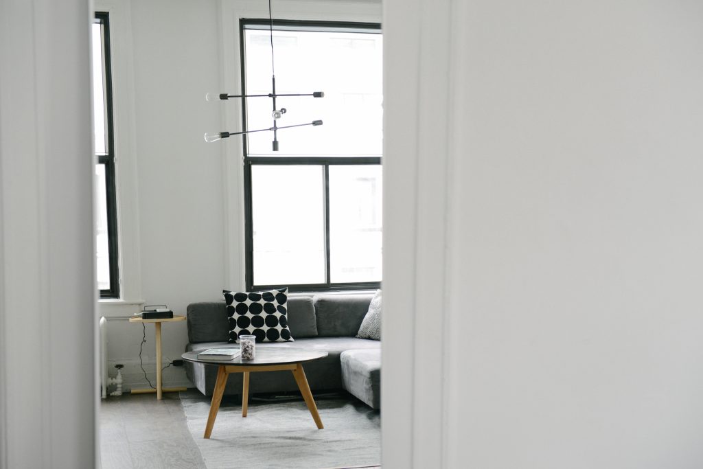
What color your living room should be: Light colors if you want a calming effect; red if you want a stimulating effect.
Depending on your family’s activities, this could go either stimulating or calming. If you’re big on the gatherings, parties and family reunions, red is a good stimulating color and pumps you up with energy. It creates a strong impression, so a whole wall of red can definitely be eye-catching. Note: if you don’t wish to overwhelm, though, use the color sparingly. Pops of red are also nice in any room if you want to make it a focal point.
Source: pexels
Light, neutral colors should produce a feeling of space in a room. If you have a small living area, consider light colors rather than dark to create the illusion of an expansive area. Light, airy fabrics for curtains and cushions will make your room seem fresh. Put small decorative pieces of color to make it look alive. Warm blues work well as accent colors with neutral tones. The great thing about neutral colors (beige, creams, whites) is that it is timeless yet allows you to play with accent colors without being too tacky.
What color your dining room should be: Red for a good appetite, yellow for cheer.
Red is, as mentioned, a stimulating color; and that includes your appetite! It also draws people together and pulls you out of a lethargic mood. Now we understand why big fast food chains’ main color is red — and why we buy extra sides!
Yellow is the color of happiness, so it is also a nice tone to set for a dining room. It’s an inviting color, perfect for setting the mood for a gathering of a group.
In a dining area, you want to evoke the feeling of inclusion and excitement with the group, so these two colors are perfect. However, because they’re both very emotional colors (red for passion, and negatively, anger; yellow for cheer, but too much can evoke irritability), make sure that you don’t go overboard in using them!
What color your office should be: blue for productivity, green for refreshment.
While blue has a calming effect, it also boosts productivity and lowers blood pressure, unlike reds which increases it. Blues also evoke a feeling of strength and dependability – which are good moods to be in as you work.
Tired from working? Make sure you have a green in your office. Looking at green colors relaxes and refreshes strained eyes; so if you were thinking about getting a small plant for your desk, do so. Some suggest setting your computer desktop display color to green, because the color is easiest for the eyes.
Source: pixabay
What color should your home gym should be: orange for energy.
A mixture of red and yellow, it creates the excitement (red) and joy (yellow) you’d need for a good workout. It’s an energetic pop of color, opposed to blues and greens, which wakes you up visually enough to influence your energy level to do your daily routine. Again, it is such a strong color, so do add splashes of orange on your wall, or accent colors – but never the whole room with orange.
What color your bedroom should be: green for a relaxing atmosphere, blue for a calming effect, lighter shades of purple for rest.
Bedrooms should evoke a restful feeling, so these colors should be more present in your room. Like we said earlier, green helps you relax and unwind. Light blues give a cool, calming effect; but avoid darker blues because that invokes sadness and chill. Purples have the same calming effect like blues, but lilacs and lavenders don’t have the same chilling effect and sets a warmer, richer, tone.
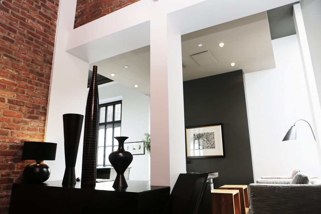
When to consider black and brown in the room:
Source: pixabay
If you’re looking to create depth for a room, black and rich, dark browns are excellent colors to apply; but use them sparingly. Too much dark colors can make the room seem overwhelming and heavy – so it’s best if you can apply them as focal points, or small accents. These colors add depth and warmth to any room. Floor boards that are in the rich color of brown feels homey and comfortable, whereas black adds sophistication.
Source: pixabay
The quality of the spaces where we spend a lot of time in has enough importance to us as it also affects, in part, the quality of our lives. As we do these small alterations to our home, we’ll see that such small changes actually improves a lot of things! Hope these tips put you in an excellent mood for every room in your home!
